Case Study
Mobile Banking Apps
Credit unions across Canada rely on a multi-tenant framework mobile app platform to enable them to compete with the resources of Canada's Big 5 banks.
The User Problem Defined
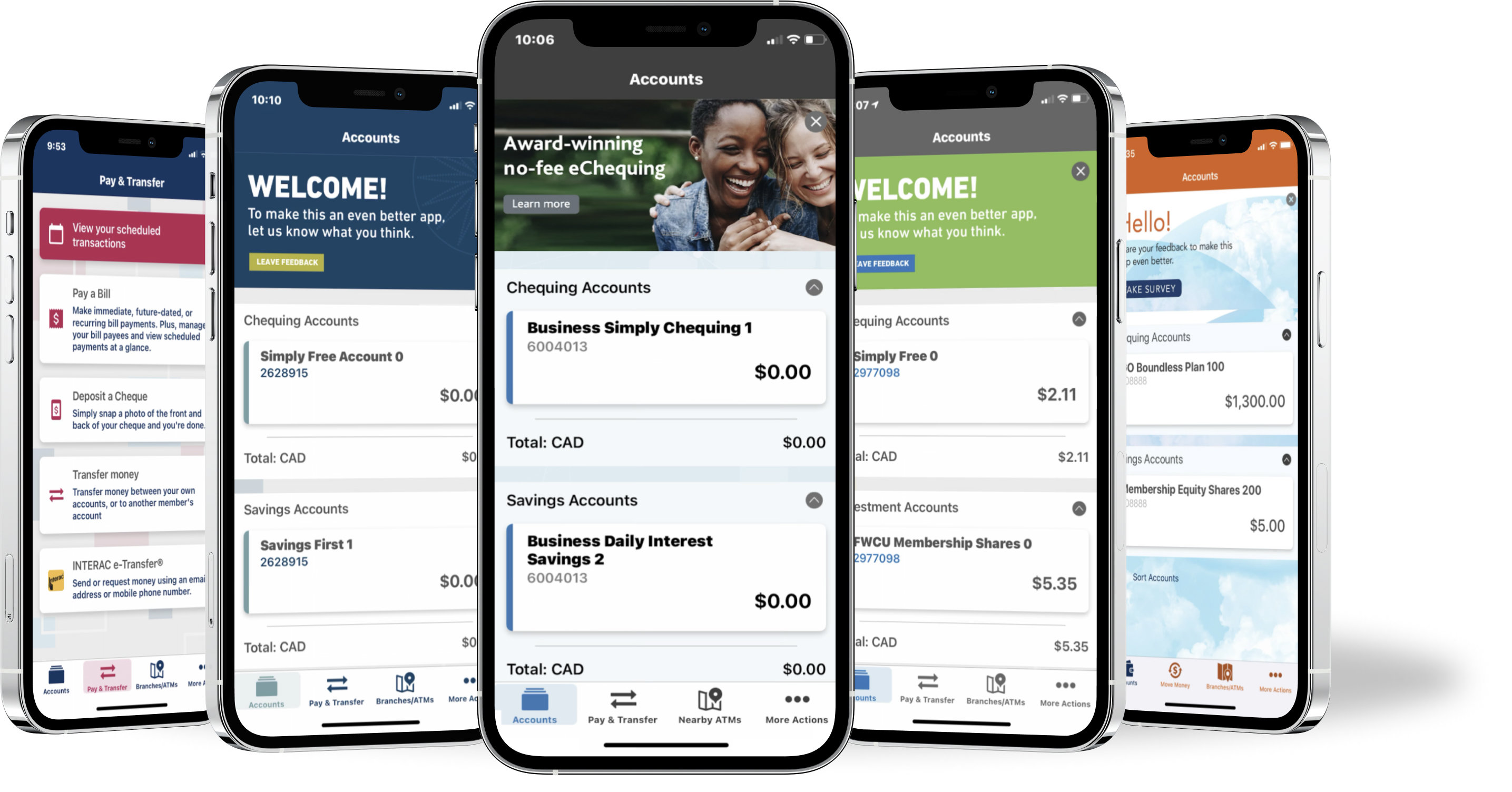
The existing mobile app was functional but dated, and as it has grown over time the UI has become inconsistent and slow. The original navigation design was easy to use with a simple, flat hierarchy, but with additional features it does not scale well and had expanded to fill mulitple pages.
The two main complaints from current users of the app are that it is slow, and that the navigation was cumbersome. New and younger users felt that the app looked dated, however existing users were generally happy with the design.
The Design Process
When re-envisioning the mobile app experience we considered:
- Popularity of features
- Navigation style and placement
- Information architecture
- The users’ journey with mobile app specific banking
I was the UX lead at the initiation of the project, and deeply involved through every iteration including a massive upheaval when the platform vendor changed. I was responsible for:
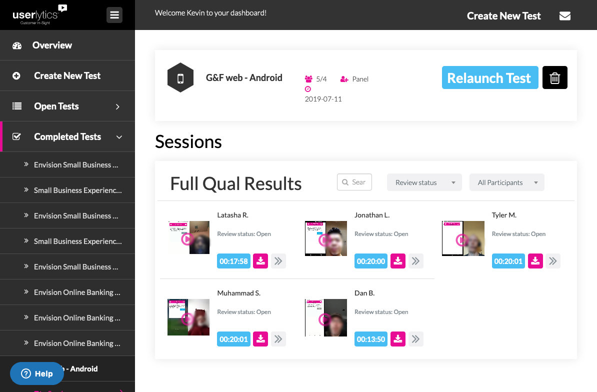
- user research in both early and late stages
- assembling content for creating user personas to guide design
- guiding work with the original design agency
- adapting assets from version 1 into version 2 when the decision was made to change platforms to Backbase
- working closely and advising the senior designers from Backbase who were flown in to ensure that our design goals meshed with Backbase’s capabilities
Challenges Overcome
The information architecture evolved as features were added to the app, especially around the settings and personal configuration. Users told us that they needed more clarity in the navigation.
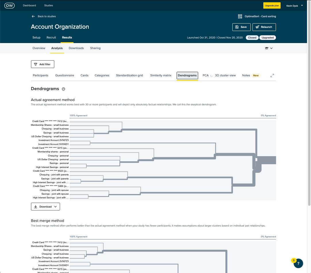
Early designs relied on the common hamburger menu pattern for navigation, however we found that the bottom-anchored navigation bar with fewer menu options works better because it handles 90% of users' needs, it's easier to reach one-handed, and the full menu is still available from the fourth menu icon.
One key feature had to be re-labelled for clarity. Stakeholder opinion had guided the decision to combine the Bill Payments and Transfers tasks into a single category called "Move Money", based on the fact that from a systems point of view the two functions are basically the same and the observation that some of our competition had also followed this pattern. User research showed us clearly that users emphatically did not see these tasks as the same - psychologically they are very different. For space reasons the tasks are still found under a single menu item, however we had the label changed to "Pay & Transfer" because those are overwhelmingly the key words that users prefer. Notably since then most of the competition has also moved away from combining the two.
The new Backbase platform came with pre-set patterns for some common interactions that differed from our early designs. Customizing the platform is possible but costly, so we triaged the issues to determine which features we needed to have enhanced and which we could accept out-of-the-box.
The project duration from concept to MVP release was long, with many changes to designs, goals and capabilities over that time. I oversaw a total of three internal UX designers, a design agency, and two designers from Backbase contributing to the final product.
Results
New designs were well received at launch with consistently better app store reviews than the previous app.
The apps have been continually updated since launch with the design evolving as needed.
The new app is 40% faster than the previous one, and supported all major features at launch.